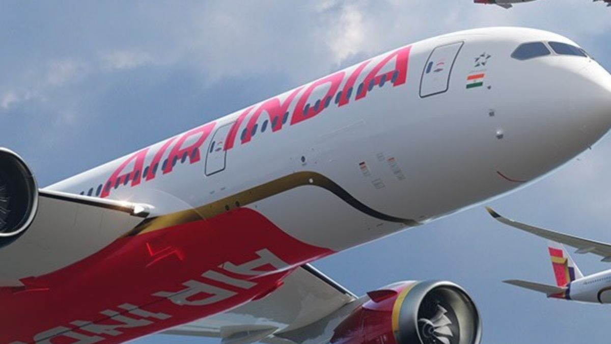
Air India rebranded the company and made some significant changes. The airline revealed its new brand identity in a ceremony in New Delhi on Thursday. N Chandrasekaran, the Air India Chairperson unveiled these new beginnings yesterday. The new identity includes a brand-new logo and a new plane livery. All these changes are part of a major transformation plan.
Air India Introduces New Branding. How Does The New Branding Look Like?
The TATA-backed airline’s new livery and design are created with the perfect balance of aubergine, golden highlights, deep red, and a pattern inspired by chakra. Its new look is a beautiful reimagination of the iconic Indian window into a golden-coloured window frame. The Indian window was previously a part of Air India. According to a press release, this new design is a symbolisation of the ‘Window of Possibilities’.
Also read: From Centaur To Maharaja, How Air India’s Logos Continue To Be Revamped
The logo sees a change in this process of branding as well. India’s oldest airline is getting a logo that is designed with a modern touch and colours such as golden, red, and purple have been used. As shared in the press release, this new logo is ‘The Vista’. Inspired by the peak of the gold window frame, this new logo symbolises ‘limitless possibilities, progressiveness, and the airline’s bold, confident outlook for the future’. FutureBrand has designed the new look of the airline.
Passengers of Air India can get to see all the additions and changes to the new brand identity from December 2023. Chief Executive Officer stated at the ceremony that everyone can see the revamped identity of the new Airbus SE A350. So you need to wait for a couple of months to see the new look of Air India.
Not just changes in design and branding, the airline is also getting ready to introduce a new website, an app, and a lot more. We just need to wait now to see all the launches in the upcoming years.
Also read: London-Bound Air India Flight Diverts Back To Mumbai Due To Technical Glitch; Details Inside
Here’s What Netizens Have To Say:
After the unveiling of the new logo, Netizens are sharing their reactions to the changes. Here are some of their reactions.
What do you think of the changes?
Cover Image Courtesy: @airindia/ Instagram

