


Logos are more than just symbols; they’re visual representations of a brand’s identity and legacy. Let’s delve into the fascinating stories behind some of the most recognizable food brands and how their logos have transformed over time.
6 Food Brand Logos And How They Evolved Over Time
1. Starbucks
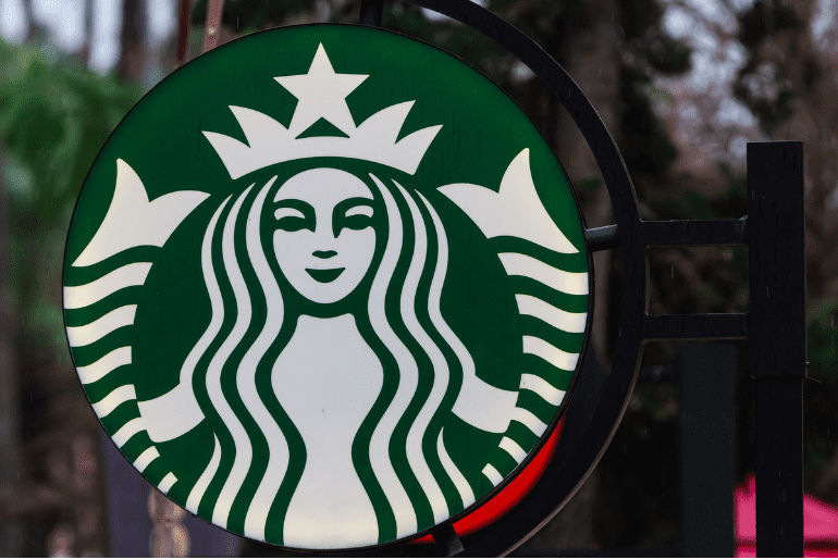
The original 1971 logo featured a siren with a bare chest and a more nautical theme. Over the years, she’s undergone several makeovers, becoming progressively more refined and less revealing. The current green and white logo retains the siren’s essence while reflecting a more modern and sophisticated brand image.
2. Domino’s

The 1960s logo resembled a traditional domino tile, lacking the brand’s signature red. The 1990s saw the introduction of the red, white, and blue colour scheme, emphasizing their commitment to fresh ingredients and speedy service. The current logo maintains these elements with a sleeker design, conveying a sense of efficiency and reliability.
3. Nestle
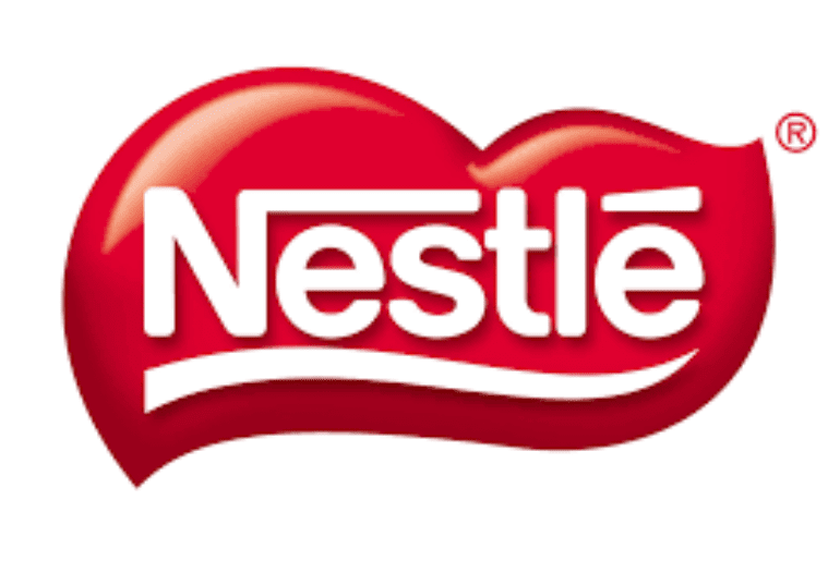
The iconic bird’s nest logo has remained remarkably consistent since its inception in 1868. Minor tweaks have been made to refine the design, but the core elements – the mother bird and her chicks – represent the brand’s values of nurturing and family.
Also Read: Find Out What These 6 Popular Airline Logos Mean!
4. Amul Girl
Debuting in 1966, the Amul girl has been the face of the Indian dairy giant’s advertising campaigns. Her playful personality and witty slogans have resonated with generations of consumers. While her attire has evolved with the times, the core message of promoting healthy and delicious dairy products remains constant.
5. Baskin Robbins
Their seemingly simple pink and brown logo holds a delightful secret. The pink sections subtly form the number 31, representing their famous promise of 31 ice cream flavours for every day of the month. This clever design reinforces their brand identity as the ultimate destination for indulging in a variety of delicious ice cream flavours.
6. Toblerone
More than just a name, the Toblerone logo held a hidden message. The mountain shape (1908) cleverly depicted the Matterhorn, a symbol of Switzerland, the brand’s birthplace. Nestled within the peak was the silhouette of a bear, representing Bern, the Swiss capital and Toblerone’s origin city. However, a recent legal change forced the brand to remove the mountain due to production facility relocation. The current logo retains the brand name in its original font.
Also Read: Hot Chocolate On Wheels! This Brand Is Selling Gluten-Free, Vegan Hot Chocolate On India’s Streets
Cover Image Courtesy: Unsplash
For more such snackable content, interesting discoveries and the latest updates on food, travel and experiences in your city, download the Curly Tales App. Download HERE.